Now that lots of you are starting to get to grips with the new MPS module in Analyser, questions are starting to come in about how we handle performance.
Our approach is a bit different to the other tools out there, so read on to find out what we do and why we do it.
The issue
MPS performance is a bit of a beast.
First of all, the exact performance a client experiences will always vary from numbers on a factsheet.
This is for all sorts of reasons, but the main one is portfolio ‘drift’, where investors become detached from the core portfolio weightings depending on when subscriptions arrive.
Some platforms operate a type of floating allocation to minimise this, others believe it pretty much all comes out in the wash. Where you stand on it is up to you.
This also means the same model may have different performance on different platforms – other factors contributing to this include how rebalancing works, when trades are placed and more. And of course not every asset is available on every platform; more little differences.
Multiply that up by 25 or so platforms, 80 MPS providers, about 250 ranges and thousands of individual portfolios with tens of thousands of individual assets in them and the issue is obvious.
How others try to solve it
Some of the major investment analytics providers try to solve this by recreating portfolios themselves.
Theoretically this allows them to build the portfolios as they appear on each platform, and as long as there is a timely and accurate daily data feed of asset holdings for each portfolio they can get close.
But of course this can’t help with portfolio drift, so even a painstaking and fraught process like this comes with limitations despite everyone’s best efforts.
At the moment, we think the only way to get a truly accurate performance figure is from a client’s individual performance report.
What we do
The quick answer is we don’t think we can solve the question of ‘how do I get a truly accurate real-world performance figure’? inside Analyser. At least, not yet.
So we think there’s no point trying to out-gun the major analytics providers – they’ve been doing what they do for a long time.
The truth is Analyser isn’t there to be an investment analytics tool. It is designed to create a defensible shortlist of MPS providers which are suitable for your target client segment or individual client requirements.
Suitability, to us, exists independently of past performance which, lest we forget, is not a guide to the future. It is entirely possible to have suitable portfolios which perform well and others which perform less well.
This is the same dynamic as pricing in platforms – some suitable platforms are cheap and others aren’t. Suitability exists independently of price too.
So the due diligence and shortlisting journey of Analyser takes you through a process to identify providers and ranges that do what you want for the clients you want.
When it comes to performance, we know that once you’ve got down to the last few under consideration you’ll likely want to go into considerable depth: some have told us you want in-depth performance attribution analyses for each proposition (others shudder at the prospect).
Our job then, as we see it in Analyser, is to give you a quick and consistent performance check.
This isn’t a substitute for in-depth performance analysis. But you’ll have enough information to confidently decide a shortlist, and then dive into the level of detail that makes you happy using the fine in-depth performance analytics tools available elsewhere.
To that end, we take performance from provider factsheets. One firm told us they didn’t like that because “it’s providers marking their own homework”. That’s a good line but it’s not very accurate.
MPS providers don’t put out misleading information – based on their calculations the figures will be right. But they won’t reflect real world performance for all the reasons above, and that’s why you need to go to the extra lengths already mentioned once you’ve got a shortlist.
So we use the quarterly factsheet data for performance and volatility, and we make it available for one, three, five, seven and 10-year time periods via a very cool interactive graph.
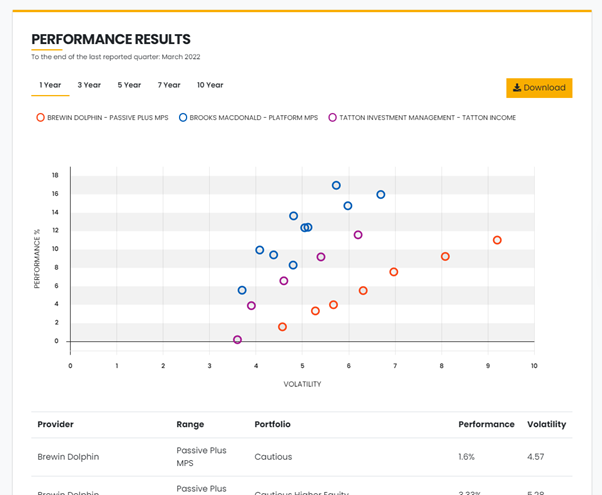
We think this gives the perfect level of detail. You get a sense of how much additional performance bang you’re getting for your clients’ risk buck as the vol level increases, and you get a sense of how various ranges compare against each other.
You’re looking for outliers here: “Why is XYZ range performing wildly better / worse than all the others? I’d better go and do some more digging.”
Analyser won’t do that digging for you – you all know the systems that will – but it will indicate where you need to dig.
And that’s it.
One day we may solve the issue of genuinely accurate performance reporting for platform-based MPS.
Until then, Analyser will do what it set out to, which is to become the go-to place for assessing which providers are suitable for your clients across features, business performance, cost and performance. After that, the rabbit holes you choose to go down are up to you.
For more on our approach to assessing MPS performance and how you can do this in Analyser, have a watch of our short demo below: